

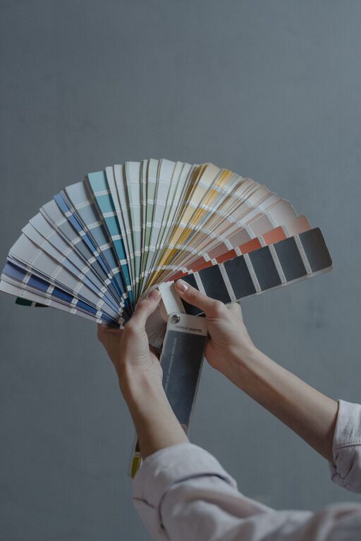
Creating a calm and peaceful atmosphere in your home starts with the colors you choose for your walls, furniture, and décor. Calm colors can make your living spaces feel more inviting, restful, and balanced. Whether you want to refresh a room or plan a full makeover, understanding how to choose soothing colors can transform your home into a personal sanctuary.
In this post, we’ll explore key tips for selecting calm colors that work well together and suit your style and lifestyle.
Why Choose Calm Colors?
Calm colors tend to have a soft, muted quality that promotes relaxation and reduces stress. Unlike bright or bold colors that can energize or overwhelm, calm shades create an environment conducive to rest and reflection. These colors are especially suitable for bedrooms, living rooms, and spaces where you unwind after a long day.
Popular Calm Color Families
Before diving into tips, here are some color families traditionally considered calming:
– Blues: Soft blues evoke tranquility and openness, reminiscent of the sky and water.
– Greens: Light or muted greens connect us to nature and bring a fresh, restful feeling.
– Neutrals: Warm beiges, soft grays, and creamy whites provide a gentle, grounding backdrop.
– Lavenders and soft purples: These subtle hues inspire calmness and creativity.
– Pastel pinks and peaches: These warm tones add warmth without being overpowering.
Tips for Choosing Calm Colors
1. Start with the Lighting in Your Space
Natural and artificial lighting affects how colors appear. Test paint samples in different lighting conditions throughout the day to see how calm colors change. A shade that looks soothing in soft morning light might seem dull or cold under bright afternoon sun or harsh artificial light.
Tip: Use paint testers on large poster boards and move them around rooms to observe color shifts.
2. Consider the Room’s Purpose
Choose calm colors that align with how you use each room:
– Bedrooms: Soft blues, muted greens, or gentle lavenders can promote restful sleep.
– Living rooms: Warm neutrals or soft greens create a welcoming environment.
– Home offices: Subtle blues or greys help maintain focus without causing stress.
– Bathrooms: Light aqua or pastel greens offer freshness and relaxation.
3. Use a Color Palette for Balance
Calm colors often work best when paired thoughtfully. Use a palette of three to four complementary colors:
– Choose a primary calm color for walls.
– Pick a secondary color for furniture or accents.
– Add a neutral color to keep balance.
– Consider a small pop of a more vibrant but still soft color to add interest.
This approach prevents spaces from feeling flat or boring.
4. Pay Attention to Undertones
Calm colors can have cool or warm undertones that change their effect:
– Cool undertones (blue, green, or purple hints) create a serene and refreshed vibe.
– Warm undertones (yellow, red, or peach hints) add coziness and softness.
Decide on undertones based on your room’s lighting and the mood you want to set.
5. Don’t Overdo It
While calm colors encourage relaxation, too much uniformity can make a space feel bland. Introduce textures and patterns through rugs, cushions, curtains, or artwork to add depth without disrupting the calm feel.
6. Think About Finish and Texture
Matte or eggshell finishes tend to soften colors and reduce glare, enhancing calmness. Glossy or high-sheen finishes can reflect more light and may be less soothing in a restful space.
7. Use Natural Materials and Accents
Complement calm colors with natural materials like wood, stone, or linen. These materials bring warmth and texture that further promote a peaceful atmosphere.
8. Personalize with Your Preferences
Ultimately, the best calm colors are ones you enjoy living with. Test samples, trust your instincts, and adjust shades until they feel just right for your home.
Examples of Calm Color Combinations
Here are a few calming palettes to inspire your choices:
– Soft gray walls with white trim and sage green accents.
– Pale blue with creamy beige and natural wood tones.
– Muted lavender paired with warm taupe and light blush.
– Light aqua combined with sand and soft charcoal gray.
Final Thoughts
Choosing calm colors for your home involves understanding how colors interact with light, space, and your personal tastes. By considering the room’s function, lighting, and color harmony, you can create spaces that feel inviting and serene. Remember to take your time testing colors and adding textures to bring your vision to life.
With the right calm palette, your home will become a restful retreat you look forward to spending time in every day. Happy decorating!